

You know MaterialUI, you know TailwindCSS but do you know Supabase UI? 😎🔥


In this blog we will be looking at Supabase UI and how to use it within a React application.
For those who have been living under a rock and have no idea what Supabase is; Supabase is an open source company building amazing tooling around Postgres. They offer auth, a complete Postgres instance for your data needs, robust storage, a realtime API and a RESTful API out of the box. They are often referred to as the open source Firebase alternative.
Supabase UI is a component library initially used internally but is now available publicly. It is built using Storybook. It utilises Tailwind and the Feather Icon library.
To get started, create an empty React application by running the following command, replacing 'my-app' with whatever you want to name the application:
npx create-react-app my-app
Then open a new terminal and run:
npm install @supabase/ui
Or close the server running your React app by typing command/control + c then pasting the above command into the terminal.
In your React application, open the App.js and remove everything then paste this in:
import './App.css';


function App() {
  return (
    <div className="App">
      <header className="App-header">
        Supabase UI with React
      </header>
    </div>
  );
}

export default App;
In App.css change the min-height property in App-header to 8vh so the header does not take up full height like so:
.App-header {
  background-color: #282c34;
  min-height: 8vh;
  display: flex;
  flex-direction: column;
  align-items: center;
  justify-content: center;
  font-size: calc(10px + 2vmin);
  color: white;
}
Now we are ready to try out most of Supabase UI. The Auth component requires Supabase JS installed and we will get to that a bit later.
Button Component
In App.js import the button component like so:
import { Button } from '@supabase/ui'
The button component accepts a set of props that can be used to customise the appearance and for different use cases. The main ones are:
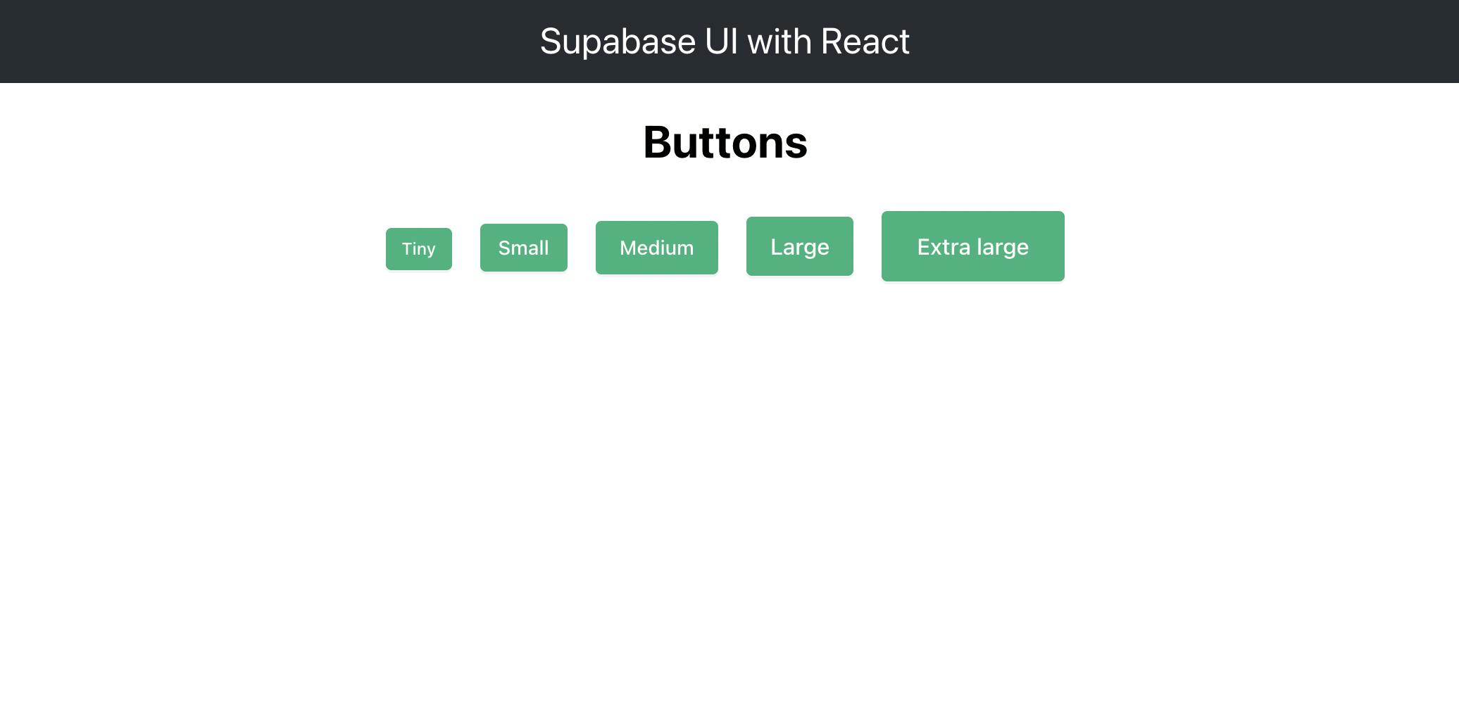
Size
This is used to define how big the button is. The choices are: tiny, small, medium, large and xlarge. If size is not specified, the component defaults to tiny and fits the text within the button.
In App.js paste this below the closing header tag:
<h1>Buttons</h1>
      <Button size="tiny" style={{margin: 10}}> Tiny </Button>
      <Button size="small" style={{margin: 10}}> Small </Button>
      <Button size="medium" style={{margin: 10}}> Medium </Button>
      <Button size="large" style={{margin: 10}}> Large </Button>
      <Button size="xlarge" style={{margin: 10}}> Extra large </Button>
It has a style prop to give some space between the buttons. Now open up your application in your browser and you should see this:
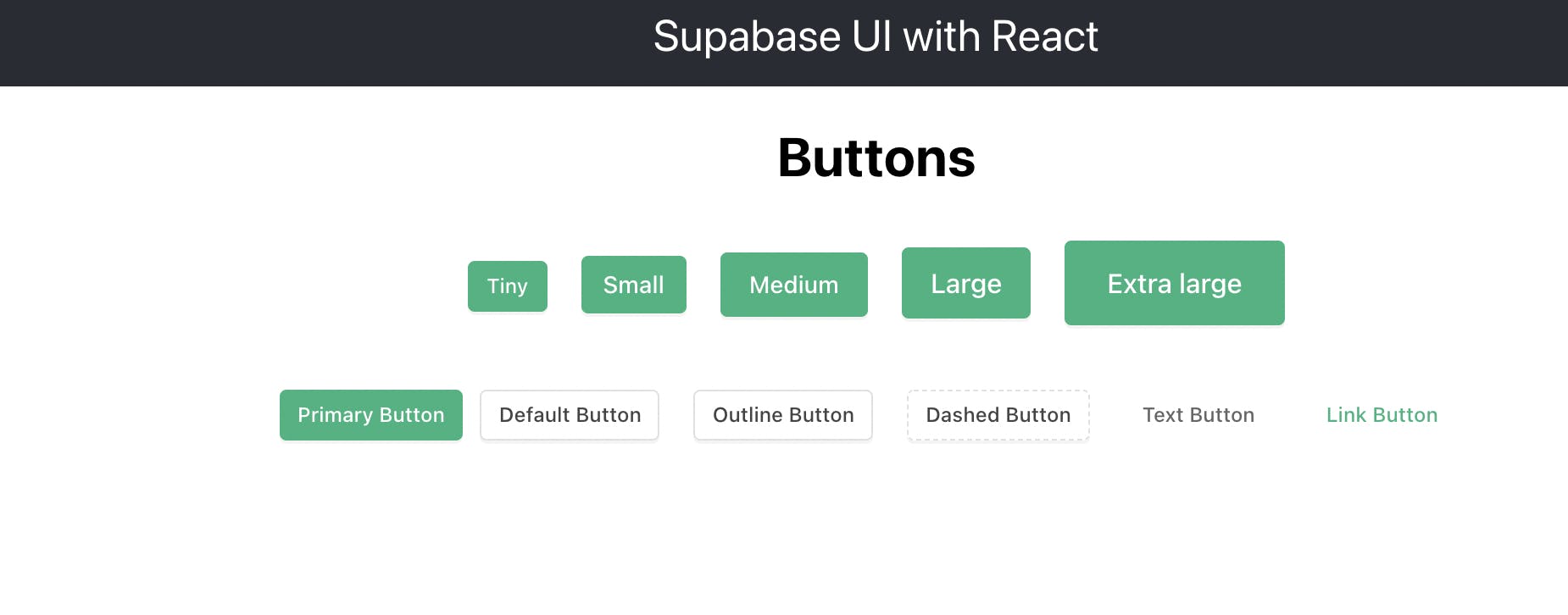
Type
This is a string that gives the button different looks depending on what is passed. The choices are: primary, default, outline, dashed, secondary and text. If unspecified, the button defaults to primary. This is similar to MaterialUI's button variants.
In App.js paste this below the code above:
 <br/> <br/>

      <Button type="primary" style={{margin: 10}}> Primary Button </Button>
      <Button type="default" style={{margin: 10}}> Default Button </Button>
      <Button type="outline" style={{margin: 10}}> Outline Button </Button>
      <Button type="dashed" style={{margin: 10}}> Dashed Button </Button>
      <Button type="text" style={{margin: 10}}> Text Button </Button>
      <Button type="link" style={{margin: 10}}>Link Button</Button>
And now you should see this in the browser:
Icon
Icons can be used within the button component by passing an Icon prop. The icons are Feather icons and are available via Supabase UI. They have the word 'Icon' added to the beginning of their original Feather names. For example: A Feather Icon named 'Anchor' would be available as 'IconAnchor' in Supabase UI.
Icons are separate components and have their own props that define their size and width as shown below:
In App.js paste this below the code above:
 <br/> <br/>

      <Button icon={<IconActivity />} style={{margin: 10}}>
          Icon Activity Button </Button>

      <Button icon={<IconAirplay size={24} strokeWidth={2}/>} style={{margin: 10}}>
          Icon Airplay Button </Button>
And you should see this in your browser:
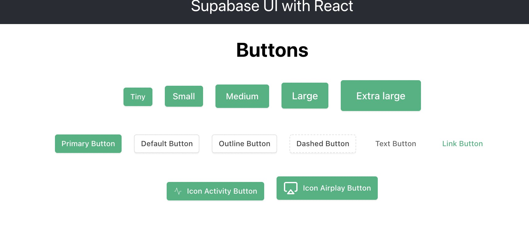
Notice that the second icon is bigger and has a wider stroke than the first icon. This is because of the size and strokeWidth props that we passed to the second button.
We can also specify what html type the button is by passing a htmlType prop that can be set to, for example, submit. The button component can also be set to full width by passing it block property.
Typography Component
The typography component accepts a set of props that can be used to customise appearance of text elements to suite different use cases. The main ones are:
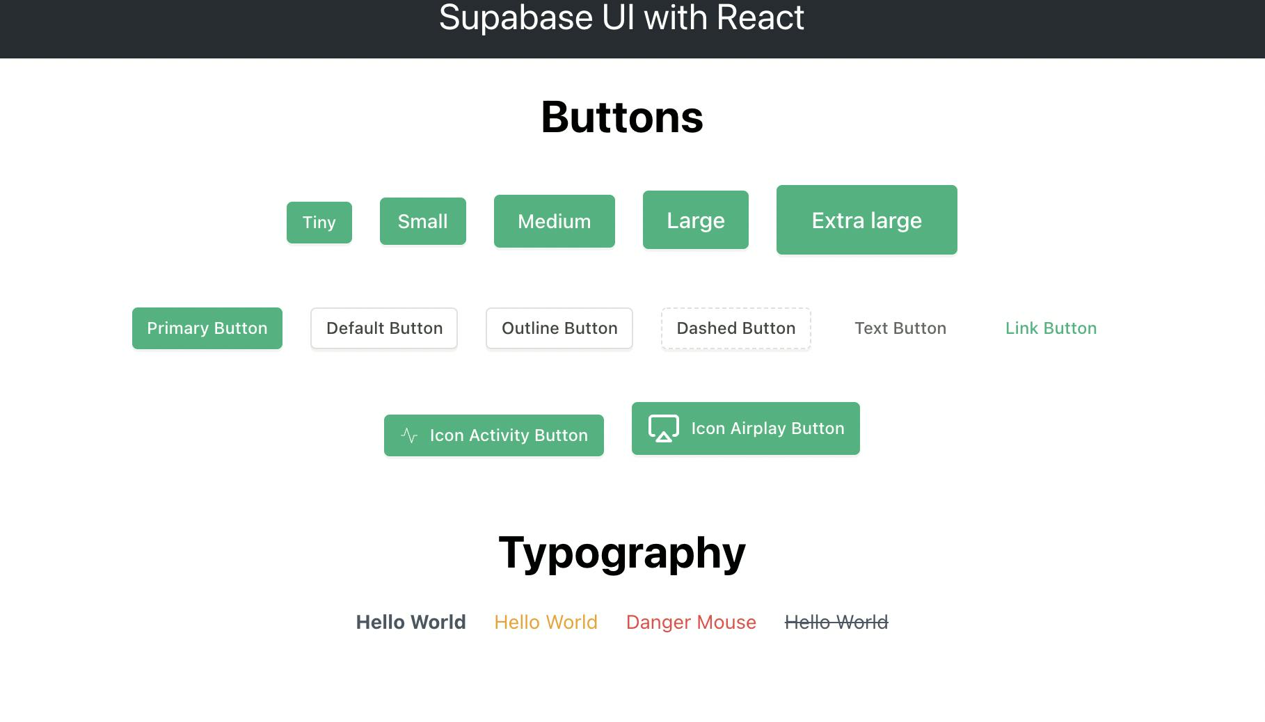
Text
This is a sub component and can be accessed via object property syntax like so:
<Typography.Text type="danger">Danger Mouse</Typography.Text>
This sub component accepts the type prop which defines how the text appears on screen. It also accepts other props such as strikethrough which draws a line through the text.
In App.js paste this below the previous code:
<br/> <br/>

      <h1>Typography</h1>
      <Typography.Text strong style={{margin: 10}}>Hello World</Typography.Text>
      <Typography.Text type='warning' style={{margin: 10}}>Hello World</Typography.Text>
      <Typography.Text type='danger' style={{margin: 10}}>Danger Mouse</Typography.Text>
      <Typography.Text strikethrough style={{margin: 10}}>Hello World</Typography.Text>
And you should see this in your browser:
Title
This is a sub component and can be accessed via object property syntax like Text above.
This sub component accepts the level prop which determines how large text appears on screen. The levels go from 1 up to 5 and correspond to html heading tags. This means that level 5 would result in a h5 tag and level 1 would be h1. It also accepts other props such as style which is a css object that you can use to customise the appearance of the title.
In App.js comment out or delete the code above the h1 tag that says 'Typography' then paste this below the last Typography component:
<br/> <br/>
      <Typography.Title level={5}>I gotta Feeling</Typography.Title>
      <Typography.Title level={4}>You</Typography.Title>
      <Typography.Title level={3}>Should</Typography.Title>
      <Typography.Title level={2}>Try</Typography.Title>
      <Typography.Title level={1} style={{color: '#14A474'}}>Supabase</Typography.Title>
And you should see this in your browser:
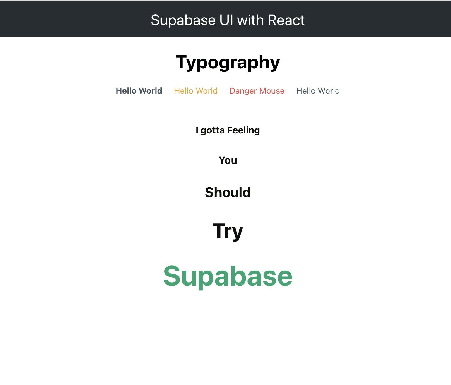
PS: You really should try Supabase 😉
Link
This is a sub component and can be accessed via object property syntax like Text above.
This sub component wraps an anchor tag and accepts the href and target props which determines what link to open up and in which tab. It also accepts other props such as style and onClick handler which is a function.
In App.js paste this below the previous code:
<br/> <br/>
    <Typography.Link href='https://ui.supabase.com/'
          target='_blank'
          style={{color: 'purple', fontWeight: 'bold', fontSize: 24}}
      >
        Check out supabase ui docs!!!
    </Typography.Link>
And you should see this link in your browser below the rest of the text:

Data Input Components
These components deal with user interaction and include Input, Select and Radio groups. In this blog, we will be looking at Input and Select components. You can always experiment more with the others as well as check out the docs.
Input
This component defaults to type text and takes in label, descriptionText and labelOptional as props to give the Input extra information that guides the user. You can also pass in an Icon to the component much in the same way as with the button component.
In App.js comment out or delete the code below the closing header tag just leaving the closing div then paste this below the closing header tag:
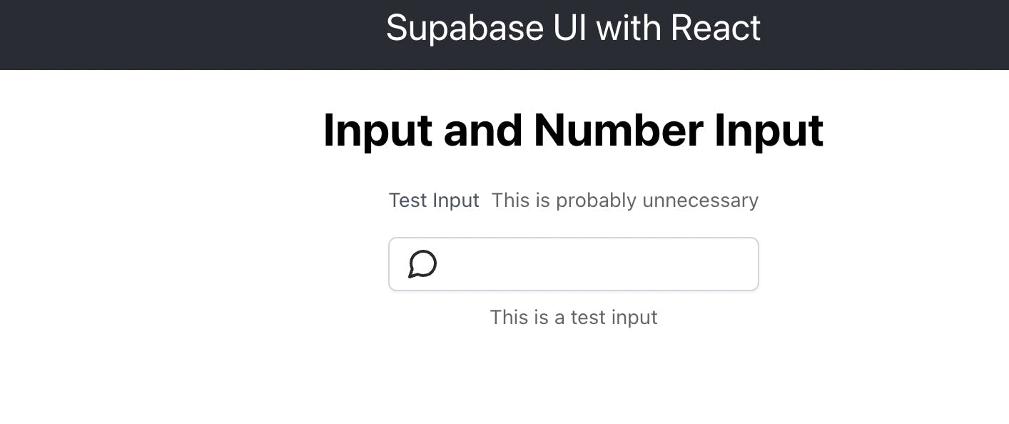
<h1>Input and Number Input</h1>
    <div style={{display: 'flex', flexDirection: 'column', justifyContent: 'center', alignItems: 'center'}}>
    <Input
      label='Test Input'
      descriptionText='This is a test input'
      labelOptional='This is probably unnecessary'
      icon={<IconMessageCircle size={24} strokeWidth={2}/>}
     />
     </div>
And you should see this in your browser:
The input component accepts a copy prop that copies the value in the Input component. Replace the contents of App.js with the below snippet:
import './App.css';
import { IconMessageCircle, Input } from '@supabase/ui'
import { useState } from 'react';


function App() {
  const[value, setValue] = useState('')
  return (
    <div className="App">
      <header className="App-header">
        Supabase UI with React
      </header>

    <h1>Input and Number Input</h1>
    <div style={{display: 'flex', flexDirection: 'column', justifyContent: 'center', alignItems: 'center'}}>
      <Input
        label='Test Input'
        descriptionText='This is a test input'
        labelOptional='This is probably unnecessary'
        icon={<IconMessageCircle size={24} strokeWidth={2}/>}
        onChange={event => setValue(event.target.value)}
        value={value}
        copy
      />
      <p>Print out the value here: {value}</p>
     </div>

    </div>
  );
}

export default App;
This adds a button with 'copy' text that copies the value of whatever you type into the Input component. Run the app and you should see this in the browser:
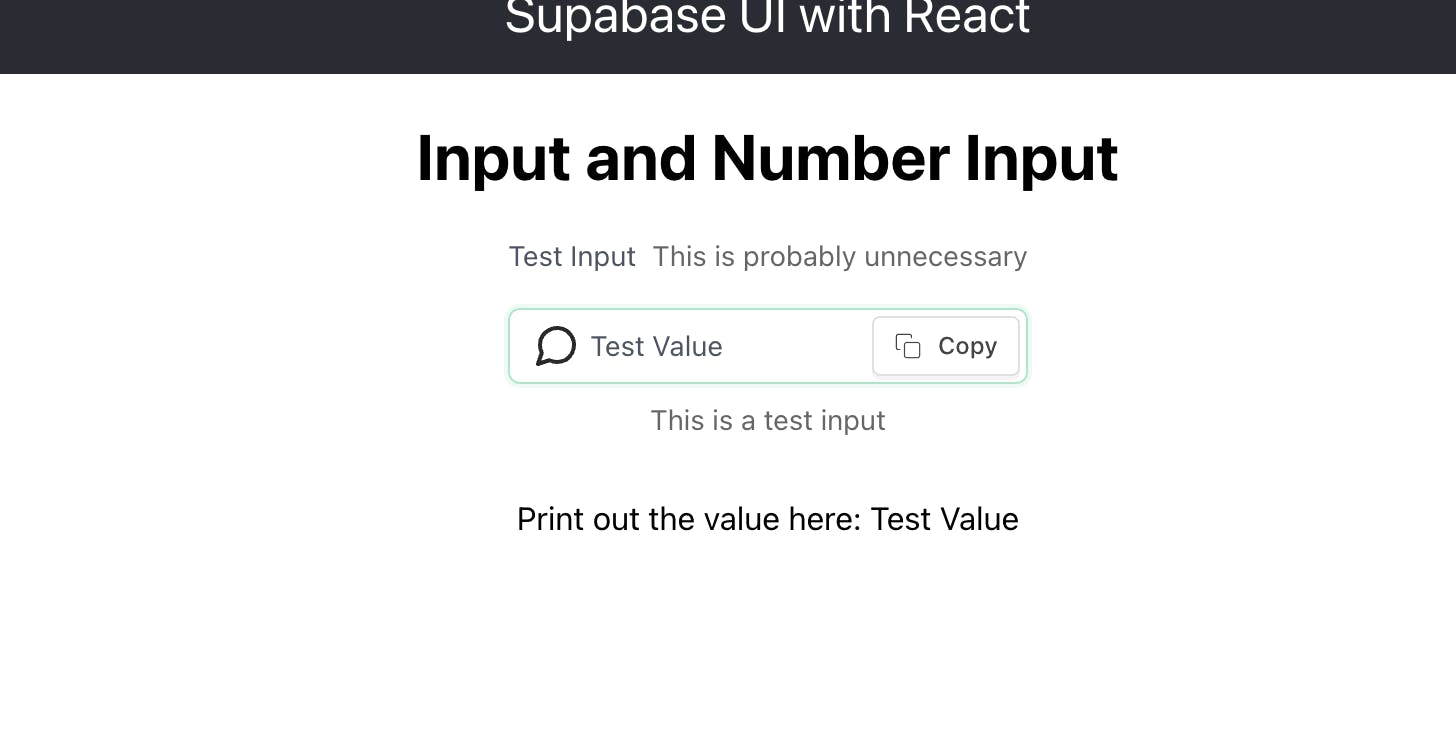
Now click the copy button and paste elsewhere. It should paste 'Test Value'.
The Input component also takes an actions prop that accepts JSX such as buttons. In the App.js, within the Input component, comment out 'copy' and paste this:
 actions={
          <Button onClick={() => setValue('')}>
            Clear Input Field
          </Button>
          }
This should display a button within the Input component that clears the input field once clicked. The Input component also accepts an error prop that you can use to display an error.
The Input component can be turned into a text area like so:
<Input.TextArea
        limit={400}
        rows={6}
      />
You can also pass a limit of maximum characters allowed and define how many rows the resulting text area should take up.
InputNumber
This component is almost identical to the Input component except it only accepts numbers and has a min and max prop that determine the limits of the number the user can type in.
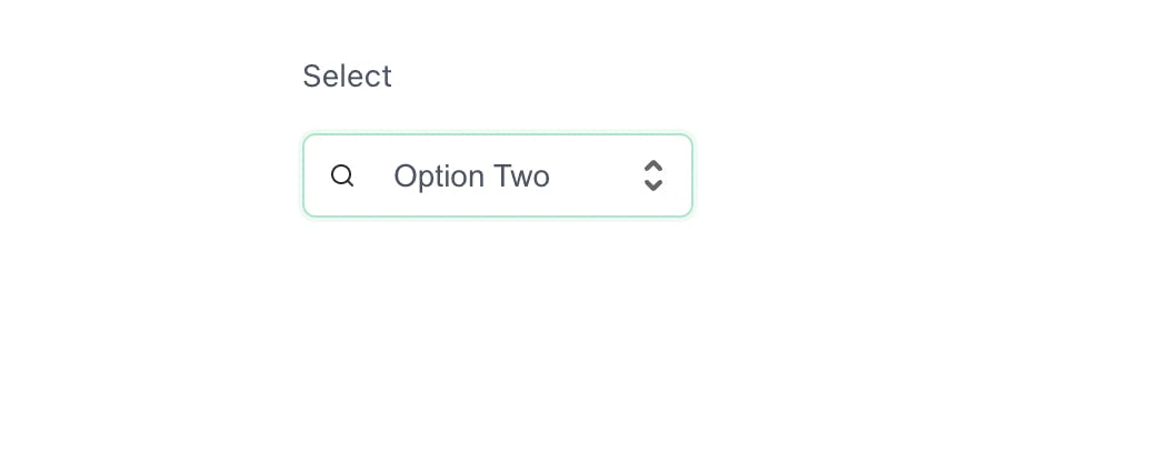
Select
This component displays a select type of input and has sub components within it to house the options associated with it. The Select component accepts label, layout and error props. You can also pass in an Icon to the component much in the same way as with the button component.
In App.js just below the InputNumber component paste the following code:
<br/>
       <Select
        layout='vertical'
        label='Select'
        icon={<IconSearch size={12} strokeWidth={2}/>}
        >
        <Select.Option>Option One</Select.Option>
        <Select.Option>Option Two</Select.Option>
        <Select.Option>Option Three</Select.Option>
      </Select>
You should see this in the browser below the rest of the components:
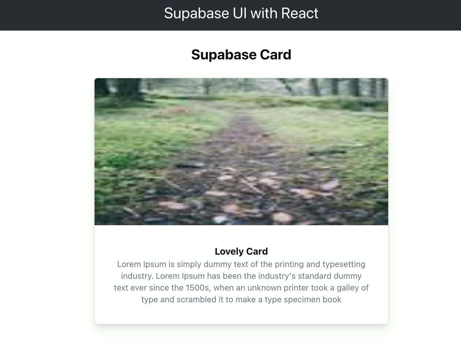
Card Component
This component displays a card that takes in a title, cover and style props. It also has a sub component that can be nested within the Card component.
In App.js, replace all with the code below:
import './App.css';
import { Typography, Card } from '@supabase/ui'


function App() {
  return (
    <div className="App">
      <header className="App-header">
        Supabase UI with React
      </header>

      <Typography.Title level={3}>Supabase Card</Typography.Title>
      <div style={{display: 'flex', flexDirection: 'column', justifyContent: 'center', alignItems: 'center'}}>

        <Card
          style={{width: 500}}
          cover={<img alt=''
                      src='https://picsum.photos/100'
                      height={250}
                      />}

        >
          <Card.Meta
            title="Lovely Card"
            description="Lorem Ipsum is simply dummy text of the printing and typesetting industry.
                          Lorem Ipsum has been the industry's standard dummy text ever since the 1500s,
                          when an unknown printer took a galley of type and scrambled it
                          to make a type specimen book"
          />

        </Card>

      </div>
    </div>
  );
}

export default App;
And you should see this lovely card 😊 in your browser:
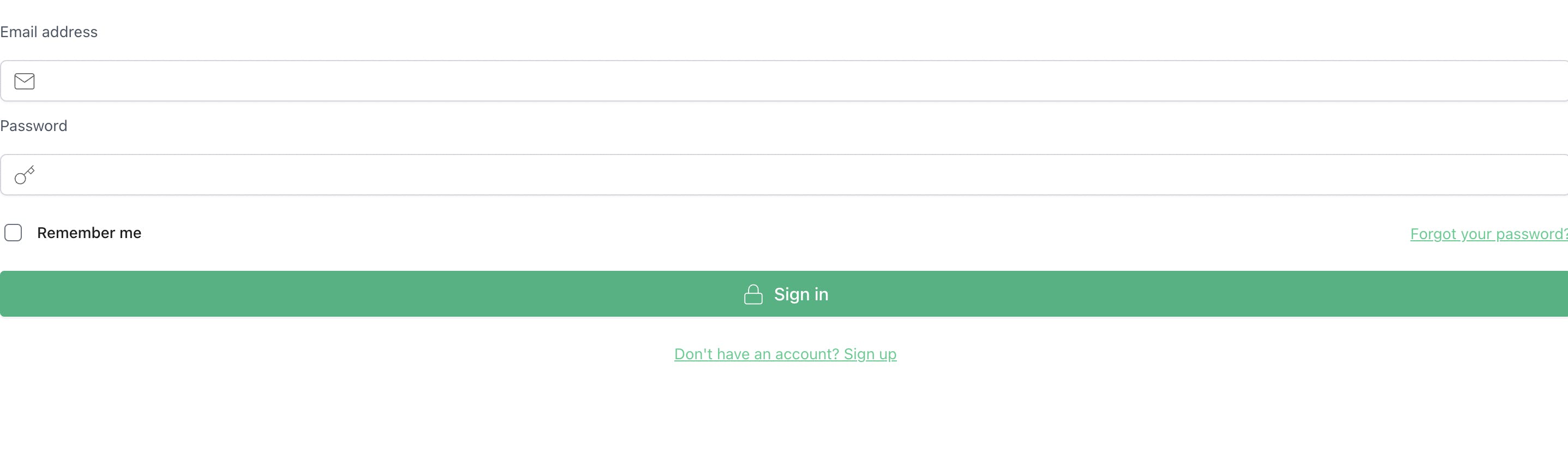
Auth Component
Now that we have looked at a few components that come with Supabase UI, let's take a look at the Auth component.
Open a second terminal and paste the following command to get the official Supabase Javascript client library installed:
npm install @supabase/supabase-js
You will need a Supabase project set up. You can go the official website to get started. After you have set up a project with Supabase, go to settings on the left hand side. Then go to Project Settings and click on API. You will find your anon public key and the project url which is what you will need.
Back to your React application, in App.js replace all with this code:
import './App.css';
import { Auth, Typography, Button } from '@supabase/ui'
import { createClient } from '@supabase/supabase-js'

const supabase = createClient('project url', 'anon key')

const Container = (props) => {
  const { user } = Auth.useUser()
  if (user)
    return (
      <>
        <Typography.Text>Signed in: {user.email}</Typography.Text>
        <Button block onClick={() => props.supabaseClient.auth.signOut()}>
          Sign out
        </Button>
      </>
    )
  return props.children
}

function App() {
  return (
    <Auth.UserContextProvider supabaseClient={supabase}>
      <Container supabaseClient={supabase}>
        <Auth supabaseClient={supabase} />
      </Container>
    </Auth.UserContextProvider>
  )
}

export default App;
Replace 'project url' and 'anon key' with the values from your Supabase dashboard settings and should see a form in your browser that just works 🔥.
Supabase UI is still being worked on and is not ready for prod just yet. You can find more information on the library and more components in the docs. You can also participate in building out the coolest UI library yet as it is open source.
Intrigued? Please leave feedback in the comments 😊.